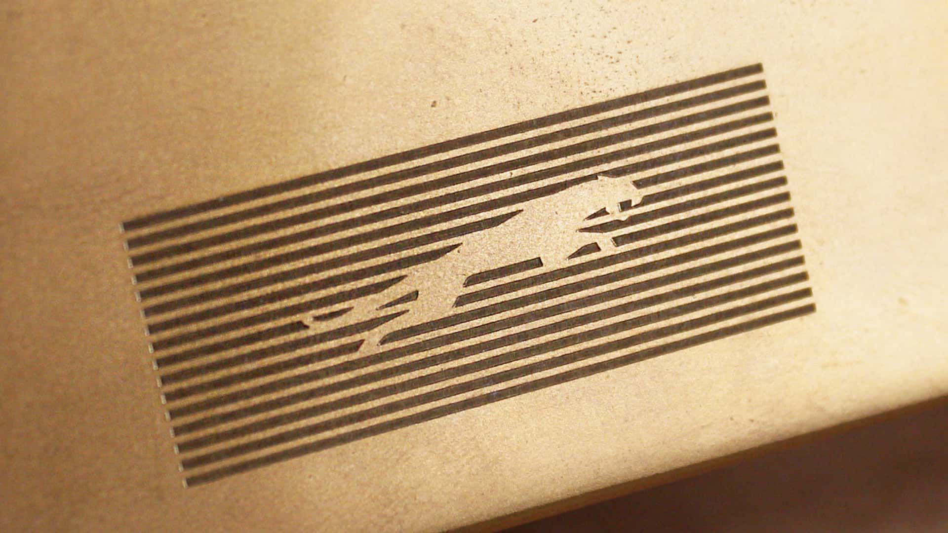
Jaguaren’t
Awh hell nah, no more JAAAAAAAAAAG :(
Skoda have done something similar with their latest offering. No Skoda badge, no radiator grill. Just SKODA in a boring font.
The font is ugly.
They’re trying to impress investors with ‘serious’ design, not stand out with a unique one
Nothing says “serious” like mixing upper and lower case letters yet keeping them all the same height, so it looks like a third grader wrote it
>New logo is soulless slop
Every single company
Makes it easier to forget them and not being able to keep them apart. That’s really great for us. Less ads in our brains.
I read this as joguar when I first scrolled by.
I hate these new logos these corporations make, the old jaguar logo looked like power the new one looks like some weird startup.
/uj Technically this is their new logo:

J a G U a r is just their new typeface (I think that’s the name?); and apparently/allegedly is to make the pronunciation closer to UK English, rather than American.
Either way, though - it’s still…
/j
…pReTtY fArKiN’ sToOoPiD.
You spell stoopid with three O"s. Maybe your the stoopid,
I would have guessed that was a Puma logo.
You’re making that up.
Slazenger
Their logo doesn’t have a jaguar and their car commercial doesn’t have any cars. Fuck it, whatever
They went from luxury car company to mediocre smartphone brand
JaGUar

Wow, they really took their logo from sexy, fast and expensive looking, to looking like an over priced soft drink?
That’s impressive, haha.
It looks like an off brand sportswear shirt you’d find on an African market.
GUys I’m from
20402035, here’s Microsoft’s logo
MS corporate comms army did a sik job getting across those inscrutable monolith vibes, I bet when it launched they all clapped (even though clapping is in performance reviews)
BONUS: heres Amazon, Faceberg and Nvideo too (yay diversity)
spoiler


We’ve gone full circle again

You’re all making fun of it but this new style did exactly what it intended to do. Everyone is talking about them now.
Yeah, for a whole 2 hours, until everyone moves on to bitch about the next thing and then Jaguar are stuck with the shitty new logo no-one recognises for long after that.
If only they sold stuff that the people talking about it could afford in the first place, maybe that’d boost their sales.


