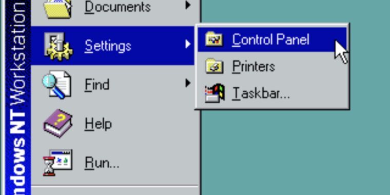
Last week, Microsoft mentioned in a support document that it was formally deprecating Windows’ 39-year-old Control Panel applets. But following widespread reporting of the change, Microsoft has either backtracked or clarified its language to remove the note about Control Panel being deprecated in favor of the Settings app. Here’s what the original post said, as also preserved by the Internet Wayback Machine (emphasis ours):
“The Control Panel is a feature that’s been part of Windows for a long time. It provides a centralized location to view and manipulate system settings and controls,” the support page explains. “Through a series of applets, you can adjust various options ranging from system time and date to hardware settings, network configurations, and more. The Control Panel is in the process of being deprecated in favor of the Settings app, which offers a more modern and streamlined experience.”
The current version of the page has changed that last sentence considerably. It now says that “many of the settings in Control Panel are in the process of being migrated to the Settings app, which offers a more modern and streamlined experience.”
It’s not clear whether this reflects a policy change or just a clarification of language. We’ve asked Microsoft whether it has changed plans to deprecate the Control Pane or if the original version of the support page was just incorrect in the first place, and we’ll update if we receive a response.


“Streamlined”
What a fucking load of steaming bullshit. The Settings app is complete dogshit compared to Control Panel. If I want to click through 6 pages of nested settings pages for Networking, or 1 screen of all the settings in one place, I think I know which one I would call “streamlined”.
Jackasses.
Also it’s just broken. Try to add an IP without gateway and it won’t let you.
Funny thing is I remember control panel being criticized for having things too many dialogs deep. Now you have more clicks when using settings instead of less.