
ThatOneKirbyMain2568
- 50 Posts
- 106 Comments


 3·5 months ago
100% with you on tenders being better than nuggets. In general, nuggets have always been kinda eh (sometimes solid, sometimes awful), and dino nuggets are the worst of their kind.
Well, I despise donuts, so it’s probably me.
What? Why would anyone cook it? What would they use that for? Who could hurt someone so badly to make them do that?
Interesting. I might be somewhat of the opposite — I think barbecue’s great, but I’m not a fan of barbecue potato chips. I’ll maybe eat some if there’s nothing else around and I’m hungry, but I’ve just never liked them.
 18·5 months ago
But Eigel isn’t alone in his condemnation of the bill. Another Republican, Missouri State Senator Sandy Crawford, claimed the incest and rape provision shouldn’t pass because “God is perfect.”
“God does not make mistakes. And for some reason he allows that to happen, bad things happen,” Crawford said. “I’m not gonna be able to support the amendments because I am very pro-life.”
You can’t help but appreciate the sheer amount of cognitive dissonance you gotta have to say, “God is perfect,” and “…for some reason He allows … bad things [to] happen.” How delusional can you be to say that raped children giving birth is part of some perfect, divine plan?
Social conservatism is a complete joke.
I think the point is more that without the serial comma, the last two items in the list aren’t separated like the others, which (imo) feels like omitting the last bullet point in a list.
EDIT: Fixed a typo.
Haha, this is gold. I’d like to think I fall more into the pedant category (except when something actually matters; then I lean towards moron).
 4·6 months ago
Oop, forgot to post the symbolism. Just posted that in a separate comment.
When I was going through redesigning all of the U.S. state flags, this is one of the first designs I made. Here’s the symbolism:
-
The colors are reminiscent of the orange, white, & blue pattern used in many of New York’s state flag.
- The blue has been replaced with the purple of the Iroquois flag.
-
The white shape in the center holds several meanings.
- It resembles a crown to represent New York being the Empire State.
- It points upward to represent New York’s motto: “Excelsior” (“Higher”).
- It looks somewhat like tall skyscrapers because duh.
-
This is my take on a flag for Kbin, a fediverse thread aggregator like Lemmy (and the one that I use). There isn’t that much to the symbolism behind it. There’s magneta because there’s magenta in the logo, and there’s a slash to go with the shape of the logo.
I also used this flag for the icon of this community’s Kbin equivalent: @vexillology.
What’s that even supposed to be? Even ignoring it’s… distinct shape, it seems like it was just a bad idea from the beginning.
Since I already like Rhode Island’s flag a lot, I didn’t want to go too far from the original design. I decided to make the following three changes:
- The background was changed from white to blue. I felt yellow on blue popped a lot more due to the higher contrast, and it helps a lot with the nautical vibe.
- The “HOPE” ribbon was removed. It’s fine, but I prefer the flag without it.
- The ratio was changed from 29:33 (🤮) to 1:1 to match maritime signal flags.
This flag was used by the Great Socialist People’s Libyan Arab Jamahiriya. As you can see, it has a very intricate design rich with symbolism.
This is a really nice flag! You’re right to feel confident about the geometry—it’s great. The colors, however, could use some work.
- In general, the shades you’ve chosen just aren’t really vibrant. Look at other flags, and you’ll see that they use pretty saturated blues, reds, yellows, greens, etc.
- You want to avoid colors that look really similar being right next to each other. You do this for the most part—for example, you separate the red and green with a white outline, which is great—but the green and blue are a problem. Green and blue are already pretty similar colors, but the shades you’ve shown make them almost identical. I’d make them much more different (for example, make the blue very dark and the green less teal) or, like another comment suggested, remove one of the colors entirely.
The image icon in the bottom left corner of image posts can be clicked, showing the image at a larger size (i.e., what you’d get if you were to enable “Auto Media Preview” in the sidebar). There are a couple of userstyles that make this more button-like, such as kleanbin and (my own userstyle) idkbin.
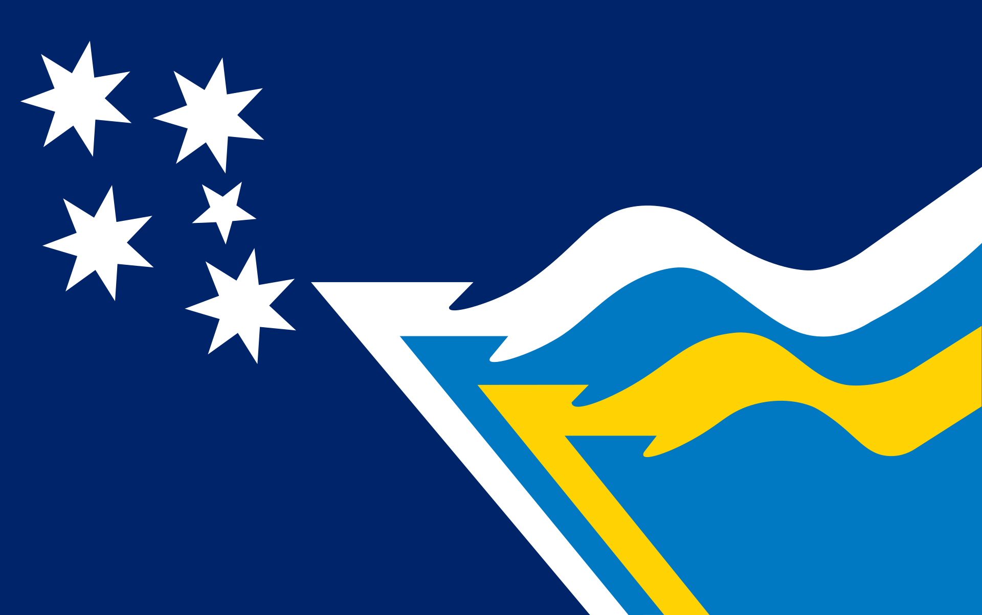
Continuing with the trend of vexillological organizations having their own flags, the Flag Society of Australia has one. While the flag within the flag looks really cool and has a nice color palette, I think the flag as a whole looks a bit odd. The Southern Cross looks weird since its stars are crowded closer together but not shrunken themselves, and the arrangement of everything just doesn’t work imo.


Sounds fun. I’ve messed around with Godot a bit myself, though I unfortunately don’t have the work ethic to make a full game out of it. Great to see more people using the FOSS option!
Sweet. I’ve found that trying to make solutions to problems is always a great way to learn more about a programming language or to introduce yourself to a new one. I imagine you’ll definitely learn a lot from this (alongside the more important achievement of making something you can use to maintain your health).


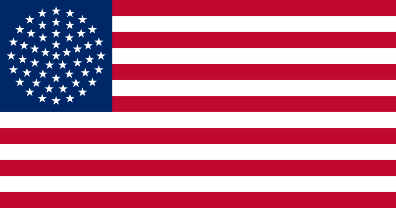
From what I can gather, this particular design was proposed by Puerto Rico’s New Progressive Party (Partido Nuevo Progresista or PNP), which advocates for Puerto Rican statehood. The circle definitely has its appeal, though I think I’d prefer something closer to the current flag.