Ɀeus
fortune favours the bold, but i favour the italic


- 2 Posts
- 41 Comments

 3·1 year ago
as a way to search inside communities: https://www.search-lemmy.com/ is in early development but it works surprisingly well usually
 1·1 year ago
ideally, [!community@instance.tld](/c/community@instance.tld) - that way the link works for everyone. howevery, the web interface does this automatically if you start typing !community
slide had a “similar” thing, so slide for lemmy probably will; but it’s in very early development and that feature doesn’t yet workedit: never mind, i just saw your comments on that sub so i guess you already knew about it
pretty unpopular opinion i believe, but i loathe them. they feel like installing apps from the windows store, but worse. i use them on steam deck and my laptop, but they often fail to launch with no feedback[1], won’t accept drag&dropped files, store their dotfiles in weird places, take up much more disc space (and therefore take literally almost 10x as long to download), won’t inherit the theme (i think because plasma stores the gtk theme in a non-standard place), etc. they feel like they’ve been designed to flout what os developers have built up over many decades and are just a struggle to use.
on steam deck particularly (so i know it’s not a configuration i’ve screwed up) no flatpaks will launch unless i launch them twice. even after that, there’s a long delay (~1 minute) and then two instances launch. i know this sounds like i should just wait until the first one launches, but that doesn’t work ↩︎

i say /fɛdˈɪəː/
hope this helps!
like grenadier or bombardier, i guess?
sublemmy is cute, trips off the tongue, and can be shortened to sub. community is more awkward to say, and shortens to comm or commie. c/ (cee-slash?) is just awful. until someone suggests something better (lemmons? lemmunities?) i’m going to keep using sublemmy
edit 2023-07-17. i have settled on lemmysphere. it is a pun, and i like it
 1·1 year ago
thank you : )
you should! i started out with a much simpler jekyll generated site

more, for those who use 88x31 buttons


 5·1 year ago
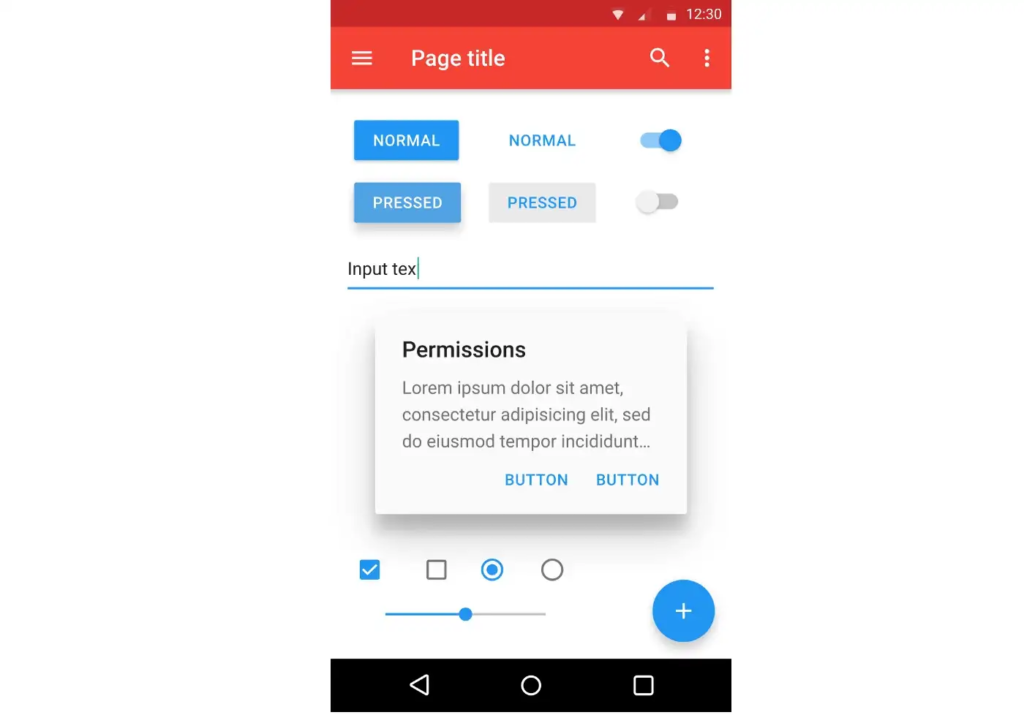
personal opinion, i think padding is worse for delineating objects than a bit of colour; or just, like, a line. look at this example - there are four distinct segments on the left, whereas on the right they all merge into one and a half
padding is really useful, yes, but if you put padding on everything then what’s there to be separated?
yeah, i hated material ew as soon as it was announced. so much padding everywhere, and so little contrast - to paraphrase the incredibles: if everything’s orange[1], nothing is. your eyes will adjust to it. i want actionable items to stand out, not be a slightly lighter shade of the same colour. it also looks rather like a fischer-price my first phone interface
i must say, if an app (for example, jerboa) uses material 3, i usually try to look for an alternative
[1] other colours are available, i just like orange
edit: some examples:
with material design, it’s clear what’s a header, what’s a footer,[2] and what each button’s state is.
with all the padding, there’s also less space; leading to less functionality
with material ew, it’s much harder to tell at a glance what each app is, one has to scrutinise the icon rather than just tell at a glance by colour
i also really dislike monet; the way it pulls this horrible washed out sickly pastel colour from a wallpaper and washes it over the entire app. if i just pulled one accent colour, and applied that to, say, the header and main action button, i’d like it a lot more
[2] look at the lack of contrast on that “new post” button
i like it. i’m glad to see a bit of depth and personality coming back into the design à la mode
have you got an 88x31 button? i’d like to link to this
(no worries if you haven’t, i’ll just use a text link)
i agree with almost all of this, but i just want to say:
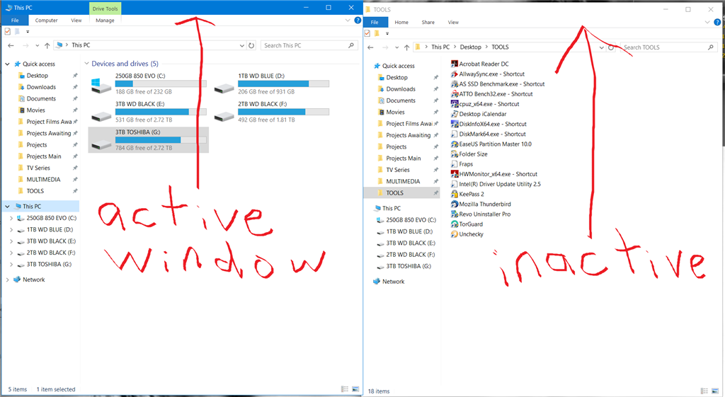
How in windows 10 can I tell if a window has focus or not? In Win 3.1 to 7 and anything running on Linux it was easy: the title bar colour was different. But since Win 8 that was dropped, windows still have focus and modal dialogs but you, the user, can not determine which has what and when.
if you tick “show accent colour on titlebars”, windows does draw the current window titlebar distinctly coloured (so i guess it’s actually better than gnome in that sense)
it’s an official http response code

oh nice, thank you. i could have sworn i checked reddact, shreddit and pds, but i guess not
i think i’ll be doing this tonight

bangs are invaluable, and the main reason i stick with ddg. having !w and !pcgw just instantly take me to the right page is great